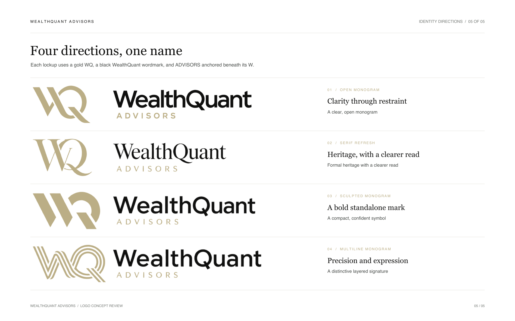
Clarity through restraint
A light, assured advisory signature.

The open gold WQ gives the identity an airy presence. Generous spacing and a clear name hierarchy make it versatile across the site and print materials.


Every direction gives WealthQuant Advisors a distinct character while holding a consistent lockup: gold WQ, black WealthQuant, and ADVISORS positioned beneath the base of the W.
A light, assured advisory signature.

The open gold WQ gives the identity an airy presence. Generous spacing and a clear name hierarchy make it versatile across the site and print materials.

A direct bridge from the existing WealthQuant identity.

The serif styling acknowledges WealthQuant’s existing white-on-black logo. Mixed-case WealthQuant makes the name easier to recognize than the existing all-caps treatment; a short, visible ADVISORS line and clearer WQ address the original mark’s readability.
Compact and confident in small branded spaces.

The solid WQ creates the strongest silhouette of the set. Its broad forms hold presence in a site header, social avatar, or other compact application while preserving the shared wordmark.
A layered signature with the most individual character.

Parallel gold paths form a measured, expressive WQ. It is strongest where the mark can breathe, such as a hero or print detail; a simplified small-size version should be tested as the identity develops.
Compare the lockups side by side in the presentation’s final page, then explore how the new identity might live within each of the three website directions.